![]()
Authors: Lucy
D’Agostino McGowan
License: MIT
The quartets package is a collection of datasets aimed to help data analysis practitioners and students learn key statistical insights in a hands-on manner. It contains:
You can install the development version of quartets like so:
devtools::install_github("r-causal/quartets")The goal of the anscombe_quartet data set is to help
drive home the point that visualizing your data is important. Francis
Anscombe generated these four datasets to demonstrate that statistical
summary measures alone cannot capture the full relationship between two
variables (here, x and y). Anscombe emphasized
the importance of visualizing data prior to calculating summary
statistics.
x and
yx
and yx and
y with a single outlierx and
y with a single outlier that serves as a high-leverage
point.In each of the datasets the following statistical summaries hold:
x: 9x: 11y: 7.5x and y: 0.816x and y:
y = 3 + 0.5xlibrary(tidyverse)
library(quartets)
ggplot(anscombe_quartet, aes(x = x, y = y)) +
geom_point() +
geom_smooth(method = "lm", formula = "y ~ x") +
facet_wrap(~dataset)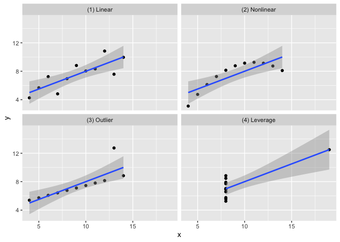
anscombe_quartet |>
  group_by(dataset) |>
  summarise(mean_x = mean(x),
            var_x = var(x),
            mean_y = mean(y),
            var_y = var(y),
            cor = cor(x, y)) |>
knitr::kable(digits = 2)| dataset | mean_x | var_x | mean_y | var_y | cor |
|---|---|---|---|---|---|
| (1) Linear | 9 | 11 | 7.5 | 4.13 | 0.82 |
| (2) Nonlinear | 9 | 11 | 7.5 | 4.13 | 0.82 |
| (3) Outlier | 9 | 11 | 7.5 | 4.12 | 0.82 |
| (4) Leverage | 9 | 11 | 7.5 | 4.12 | 0.82 |
The goal of the causal_quartet data set is to help drive
home the point that when presented with an exposure, outcome, and some
measured factors, statistics alone, whether summary statistics or data
visualizations, are not sufficient to determine the appropriate causal
estimate. Additional information about the data generating mechanism is
needed in order to draw the correct conclusions. See this
paper for details.
ggplot(causal_quartet, aes(x = exposure, y = outcome)) +
  geom_point() +
  geom_smooth(method = "lm", formula = "y ~ x") +
  facet_wrap(~dataset)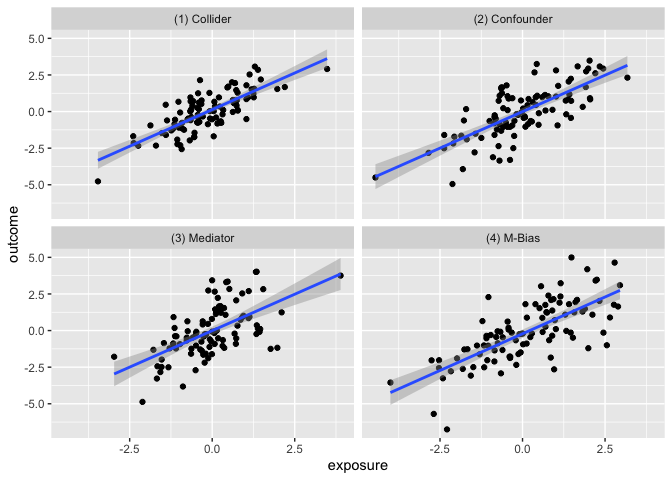
causal_quartet |>
  nest_by(dataset) |>
  mutate(`Y ~ X` = round(coef(lm(outcome ~ exposure, data = data))[2], 2),
         `Y ~ X + Z` = round(coef(lm(outcome ~ exposure + covariate, data = data))[2], 2),
         `Correlation of X and Z` = round(cor(data$exposure, data$covariate), 2)) |>
  select(-data, `Data generating mechanism` = dataset) |>
knitr::kable()| Data generating mechanism | Y ~ X | Y ~ X + Z | Correlation of X and Z |
|---|---|---|---|
| (1) Collider | 1 | 0.55 | 0.7 |
| (2) Confounder | 1 | 0.50 | 0.7 |
| (3) Mediator | 1 | 0.00 | 0.7 |
| (4) M-Bias | 1 | 0.88 | 0.7 |
Similar to Anscombe’s Quartet, the Datasaurus Dozen has additional data sets where the mean, variance, and Pearson’s correlation are identical, but visualizations demonstrate the large difference between datasets. This dataset is re-exported from the datasauRus R package.
ggplot(datasaurus_dozen, aes(x = x, y = y)) +
  geom_point() +
  geom_smooth(method = "lm", formula = "y ~ x") +
  facet_wrap(~dataset)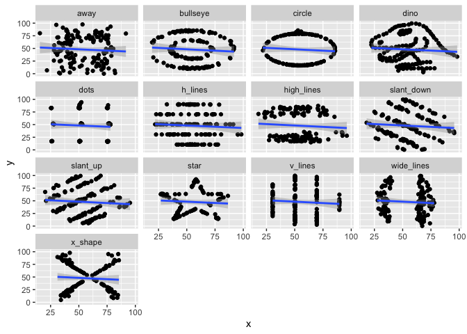
datasaurus_dozen |>
  group_by(dataset) |>
  summarise(mean_x = mean(x),
            var_x = var(x),
            mean_y = mean(y),
            var_y = var(y),
            cor = cor(x, y)) |>
knitr::kable(digits = 2)| dataset | mean_x | var_x | mean_y | var_y | cor |
|---|---|---|---|---|---|
| away | 54.27 | 281.23 | 47.83 | 725.75 | -0.06 |
| bullseye | 54.27 | 281.21 | 47.83 | 725.53 | -0.07 |
| circle | 54.27 | 280.90 | 47.84 | 725.23 | -0.07 |
| dino | 54.26 | 281.07 | 47.83 | 725.52 | -0.06 |
| dots | 54.26 | 281.16 | 47.84 | 725.24 | -0.06 |
| h_lines | 54.26 | 281.10 | 47.83 | 725.76 | -0.06 |
| high_lines | 54.27 | 281.12 | 47.84 | 725.76 | -0.07 |
| slant_down | 54.27 | 281.12 | 47.84 | 725.55 | -0.07 |
| slant_up | 54.27 | 281.19 | 47.83 | 725.69 | -0.07 |
| star | 54.27 | 281.20 | 47.84 | 725.24 | -0.06 |
| v_lines | 54.27 | 281.23 | 47.84 | 725.64 | -0.07 |
| wide_lines | 54.27 | 281.23 | 47.83 | 725.65 | -0.07 |
| x_shape | 54.26 | 281.23 | 47.84 | 725.22 | -0.07 |
This set of 3 datasets demonstrating that while the slopes estimated by a simple linear interaction model may be the same, the underlying data-generating mechanisms can be vastly different.
ggplot(interaction_triptych, aes(x, y)) +
  geom_point(shape = "o") +
  geom_smooth(method = "lm", formula = "y ~ x") +
  facet_grid(dataset ~ moderator)
This dataset demonstrates that model diagnostics alone (such as \(R^2\) and RMSE) do not tell the full story of a prediction model. Here, there are three predictors and one outcome. Models fit using a regression tree, linear regression, random forest, and neural network all yield the same \(R^2\) and RMSE, but are finding different relationships between the predictors, as evidenced by the below partial dependence plots.
set.seed(1568)
library(tidymodels)
library(DALEXtra)
rec <- recipe(y ~ ., data = rashomon_quartet_train)
## Regression Tree
wf_tree <- workflow() |>
add_recipe(rec) |>
add_model(
decision_tree(mode = "regression", engine = "rpart",
tree_depth = 3, min_n = 250)
)
tree <- fit(wf_tree, rashomon_quartet_train)
exp_tree <- explain_tidymodels(
tree,
data = rashomon_quartet_test[, -1],
y = rashomon_quartet_test[, 1],
verbose = FALSE,
label = "decision tree")
## Linear Model
wf_linear <- wf_tree |>
update_model(linear_reg())
lin <- fit(wf_linear, rashomon_quartet_train)
exp_lin <- explain_tidymodels(
lin,
data = rashomon_quartet_test[, -1],
y = rashomon_quartet_test[, 1],
verbose = FALSE,
label = "linear regression")
## Random Forest
wf_rf <- wf_tree |>
update_model(rand_forest(mode = "regression",
engine = "randomForest",
trees = 100))
rf <- fit(wf_rf, rashomon_quartet_train)
exp_rf <- explain_tidymodels(
rf,
data = rashomon_quartet_test[, -1],
y = rashomon_quartet_test[, 1],
verbose = FALSE,
label = "random forest")
## Neural Network
library(neuralnet)
nn <- neuralnet(
y ~ .,
data = rashomon_quartet_train,
hidden = c(8, 4),
threshold = 0.05)
exp_nn <- explain_tidymodels(
nn,
data = rashomon_quartet_test[, -1],
y = rashomon_quartet_test[, 1],
verbose = FALSE,
label = "neural network")We can see that each of these models “perform” the same.
mp <- map(list(exp_tree, exp_lin, exp_rf, exp_nn), model_performance)
tibble(
  model = c("Decision tree", "Linear regression", "Random forest", "Neural network"),
  R2 = map_dbl(mp, ~.x$measures$r2),
  RMSE = map_dbl(mp, ~.x$measures$rmse)
  ) |>
knitr::kable(digits = 2)| model | R2 | RMSE |
|---|---|---|
| Decision tree | 0.73 | 0.35 |
| Linear regression | 0.73 | 0.35 |
| Random forest | 0.73 | 0.35 |
| Neural network | 0.73 | 0.35 |
But the way they fit to the actual predictors is quite different:
pd_tree <- model_profile(exp_tree, N=NULL)
pd_lin <- model_profile(exp_lin, N=NULL)
pd_rf <- model_profile(exp_rf, N=NULL)
pd_nn <- model_profile(exp_nn, N=NULL)
plot(pd_tree, pd_nn, pd_rf, pd_lin)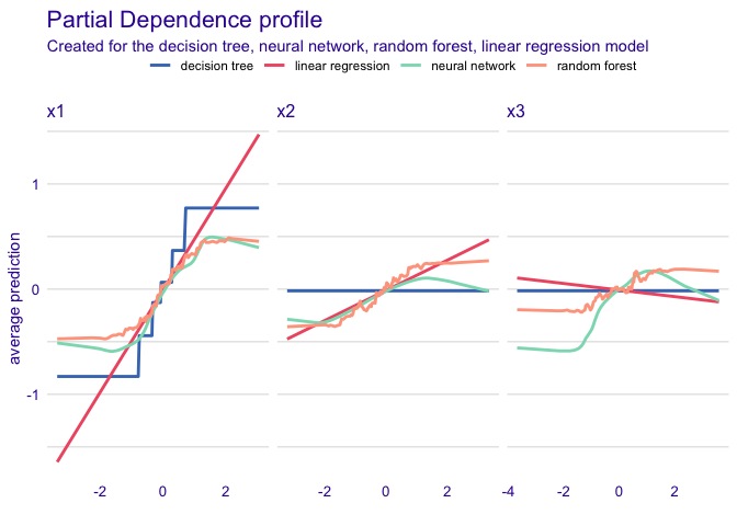
The first set of data variation_causal_quartet
demonstrates that you can get the same average treatment effect despite
variability across some pre-treatment characteristic (here called
z).
ggplot(variation_causal_quartet, aes(x = covariate, y = outcome, color = factor(exposure))) +
  geom_point(alpha = 0.5) +
  facet_wrap(~ dataset) +
  labs(color = "exposure group")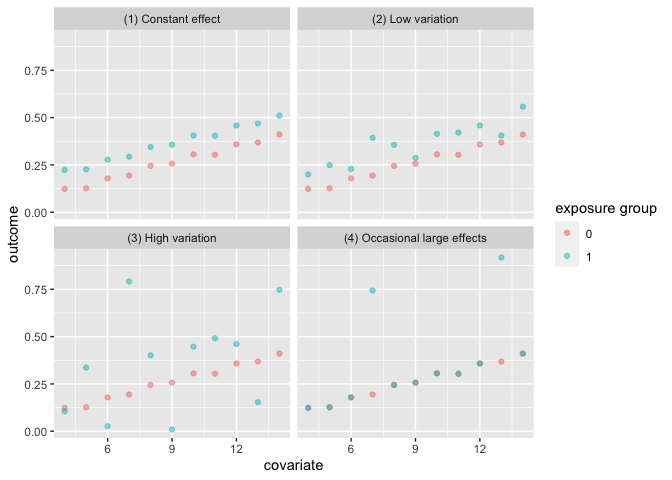
variation_causal_quartet |>
  nest_by(dataset) |>
  mutate(ATE = round(coef(lm(outcome ~ exposure, data = data))[2], 2)) |>
  select(-data, dataset) |>
knitr::kable()| dataset | ATE |
|---|---|
| (1) Constant effect | 0.1 |
| (2) Low variation | 0.1 |
| (3) High variation | 0.1 |
| (4) Occasional large effects | 0.1 |
The heterogeneous_causal_quartet demonstrates how you
can observe the same causal effect under different patterns of treatment
heterogeneity.
ggplot(heterogeneous_causal_quartet, aes(x = covariate, y = outcome, color = factor(exposure))) +
  geom_point(alpha = 0.5) +
  facet_wrap(~ dataset) +
  labs(color = "exposure group")
heterogeneous_causal_quartet |>
  nest_by(dataset) |>
  mutate(ATE = round(coef(lm(outcome ~ exposure, data = data))[2], 2)) |>
  select(-data, dataset) |>
knitr::kable()| dataset | ATE |
|---|---|
| (1) Linear interaction | 0.1 |
| (2) No effect then steady increase | 0.1 |
| (3) Plateau | 0.1 |
| (4) Intermediate zone with large effects | 0.1 |
Anscombe, F. J. (1973). “Graphs in Statistical Analysis”. American Statistician. 27 (1): 17–21. doi:10.1080/00031305.1973.10478966. JSTOR 2682899.
Biecek P, Baniecki H, Krzyziński M, Cook D (2023). Performance is not enough: the story of Rashomon’s quartet. Preprint arXiv:2302.13356v2.
D’Agostino McGowan L, Barrett M (2023). Causal inference is not a statistical problem. Preprint arXiv:2304.02683v1.
Davies R, Locke S, D’Agostino McGowan L (2022). datasauRus: Datasets from the Datasaurus Dozen. R package version 0.1.6, https://CRAN.R-project.org/package=datasauRus.
Gelman, A., Hullman, J., & Kennedy, L. (2023). Causal quartets: Different ways to attain the same average treatment effect. arXiv preprint arXiv:2302.12878.
Hullman J (2023). causalQuartet: Create Causal Quartets for Interrogating Average Treatment Effects. R package version 0.0.0.9000.
Matejka, J., & Fitzmaurice, G. (2017). Same Stats, Different Graphs: Generating Datasets with Varied Appearance and Identical Statistics through Simulated Annealing. CHI 2017 Conference proceedings: ACM SIGCHI Conference on Human Factors in Computing Systems. Retrieved from https://www.autodesk.com/research/publications/same-stats-different-graphs
Rohrer, Julia M., and Ruben C. Arslan. “Precise answers to vague questions: Issues with interactions.” Advances in Methods and Practices in Psychological Science 4.2 (2021): 25152459211007368.